In this newsletter, I try to balance tackling hot topics (Like the Supreme Court edition two weeks ago) with less urgent, but no less important topics (last week’s edition on materialism).
This is one of those less urgent, but big-picture-important topics: How do we understand the world we live in?
I’ve recently read about five crazy-interesting maps online and wanted to share them. They challenged the way I think about the importance of neighborhoods in a child’s lifetime outcomes and changed the way I understood the geography of the United States.
Check them out, or at least browse the maps I’ve included here, and change your perspective on the world.
In this edition:
1. How America uses its land
2. An alternative drawing of state lines
3. A map of every building in America
4. How neighborhoods shape children for life
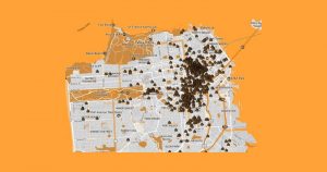
5. The San Francisco poop map
Read widely. Read wisely.
Max
RECOMMENDED READINGS
1. A new view of land in America
“Here’s How America Uses Its Land” – Bloomberg (10 min)
Summary
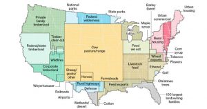
Super-creative use of U.S. Dept of Agriculture data to visualize how all U.S. land is used. My favorite map is above, but the article has many more cool visualizations if you click through.
Some highlights:
- Urban areas make up just 3.6 percent of the total size of the 48 contiguous states, but four in five Americans live, work and play there.
- The U.S. is becoming more urban—at an average rate of about 1 million additional acres a year. That’s the equivalent of adding new urban area the size of Los Angeles, Houston and Phoenix combined.
- More than one-third of U.S. land is used for pasture—by far the largest land-use type in the contiguous 48 states.
- 41 percent of U.S. land in the contiguous states revolves around livestock (Between pastures and cropland used to produce feed)
- Since 2008 the amount of land owned by the 100 largest private landowners has grown from 28 million acres to 40 million, an area larger than the state of Florida.
2. Should we re-draw state lines?
“What the U.S. map should really look like” – The Washington Post (10 min)
Summary
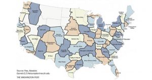
“State boundaries matter for all sorts of reasons. The state you live in determined how much your vote counted in the 2016 election. It shapes what kind of benefits your employer might offer you, what taxes you pay, what kind of schools you can attend, and much more.
“And yet, most state boundaries were drawn during the 17th to 19th centuries, says Garrett Nelson, a historical geographer at Dartmouth College. “Why should we think that areas which were drawn up for horses and buggies still make sense for interstates and telecommuting?”
Nelson has suggested how we might redraw the U.S. map today based on real commuting patterns and economic activity.
3. Our Built Environment
“A Map of Every Building in America” – The New York Times (6 min)
Summary
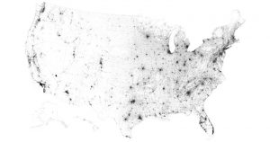
The Times put together a map of every building in America. It’s interactive so it’s interesting to explore the buildings in your own zip code and to see how much of the U.S. is built-out and in what patterns.
Selection
“These images are drawn from a huge database that Microsoft released to the public this year. The company’s computer engineers trained a neural network to analyze satellite imagery and then to trace the shapes of buildings across the country. Such information has been available before in some places, but this is the first comprehensive database covering the entire United States.”
4. Neighborhood = destiny?
“Detailed New National Maps Show How Neighborhoods Shape Children for Life” – New York Times (12 min)
Summary
“…where children live matters deeply in whether they prosper as adults. On Monday the Census Bureau, in collaboration with researchers at Harvard and Brown, published nationwide data that will make it possible to pinpoint — down to the census tract, a level relevant to individual families — where children of all backgrounds have the best shot at getting ahead.
The article features an interactive map that predicts economic outcomes by race and by neighborhood nationwide. I don’t have a preview image but it’s pretty interesting.
Selection
Children raised in poor families in some neighborhoods of Memphis went on to make just $16,000 a year in their adult households; children from families of similar means living in parts of the Minneapolis suburbs ended up making four times as much.
The researchers believe much of this variation is driven by the neighborhoods themselves, not by differences in what brings people to live in them. The more years children spend in a good neighborhood, the greater the benefits they receive. And what matters, the researchers find, is a hyper-local setting: the environment within about half a mile of a child’s home.
Read the whole article and check out the map
5. Mapping Poop in SF
Summary
A map draws attention to the issue of homelessness in San Francisco by crowdsourcing reports of human waste on city streets. An estimated 10,000 homeless people live on San Francisco’s streets.
There is a ballot initiative to tax big tech companies to fund homeless services, supported by Marc Benioff of Salesforce and opposed by Twitter’s Jack Dorsey.
Postscript
90+% of the time I’m looking at a map it is through the four-inch screen of my phone. Digital navigation is by far my favorite smartphone app. But I still appreciate a big map.
Looking at the world through a tiny screen, I lose the perspective of having the big picture. Big maps show us how small we are. Digital navigation apps put us at the center – the only thing you see is where you are going and what you are searching for. I suppose they feed our narcissistic tendencies. Add this to the list of things that our digital era makes convenient but at a hidden social/psychological cost.
I do, however, love the electronic maps I shared today, which are only made possible by huge digital data sets. Some other maps I’d like to see:
- “Most well-read neighborhoods,” judged by Amazon book purchases
- “Friendliest neighborhoods” – I’m not sure how to judge that, but wouldn’t it be great to know if you would have awesome neighbors when you moved?
- “Neighborhoods where property values are about to increase” – so you can buy low and sell high!
- “Happiest cities/neighborhoods“ My guess is that it wouldn’t correlate with property values.
MailChimp, the app I use to send The Weekend Reader, offers a map of subscribers and where people are who open the email. I just discovered it and found we have readers in more than 60 countries around the world. That is so exciting! Thank you for reading, all over the world.Read widely. Read wisely.
– Max
P.s. Did you enjoy this reader? Share the joy and send it to a friend who lives on a different part of your map!